
Does your studio website need a makeover? Mine, too!

When's the last time you've spruced up your studio website? It's been years since I've thought about the look of mine! Around five years ago, I quickly purchased LeilaViss.com and created a landing-place for people to find this 88PK blog, my book (The iPad Piano Studio) and my home studio. Once I got it up and running (with little guidance), I let it go and it shows.
If you've ever seen our home or my studio, you'll know that I care a great deal about how things look. Then why would I let the upkeep of my website slide?
All these thoughts came rushing to mind when I heard Janna Carlson's recent podcast interview with Tim Topham. Janna attended our 88 Creative Keys Workshop last year and I was so excited to hear how she has grown a booming studio in North Carolina AND started a brand new web design business with her husband. I knew my website needed a makeover and they were the team to do it!
Are you feeling the need for a studio website remodel? Do you need help? Then keep reading...
A huge thank you to Janna and Jeremy for their incredibly easy-to-understand tour of what makes a good website and how mine could be better.
Great NEWS! Read to the end and learn about the special discount they are sharing with 88PK readers.
-Leila
PS Stay tuned for a follow-up blog as I'm hiring Janna and Jeremy to continue with what they've started. :-)
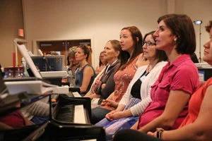
When I met Leila last summer at the 88 Creative Keys Workshop, I was blown away by the wealth of creativity that she and Bradley Sowash brought to those of us in attendance. It was one of the most memorable and inspiring experiences of my teaching career.
Since then, I’ve used her resources again and again throughout my teaching. Leila continues to be a source of creative inspiration as I help my students become confident musicians.
This year, I launched a new business called Studio Rocket Web Design. My husband and I are a team, building websites for music studios. It’s been an exciting new season of creativity in both my teaching and our new business.
A few weeks ago, Leila reached out to me and said:
I would REALLY like to see you pick apart a bad website and give us tips on how to change it….but that could be cruel. Like a website ‘Extreme Makeover.’ [Would you] take a look at mine and give me some tips on what needs work and also what you like?
It would be impossible to say no to that!
So we spent some time on the music studio side of Leila’s website and found some key ways she could improve her site.
I’ll share with you what we found, what Leila’s doing well, and what she could change to improve her results.
Do you suspect that your studio website could use some improvement? Are you curious about what it would look like to overhaul your website?
Keep reading! This post will give you five clear areas of focus on your website, along with concrete ways to improve each area so that your website represents you well.
At the end, we have a big, exciting reveal for you and for Leila!
1. Welcome Parents at the Front Door

Let’s imagine that your studio website is like a house. When a guest arrives at your home for the first time, where do you greet them?
At the front door, of course.
Your homepage is your studio’s virtual front door; it’s where every parent who is looking for music lessons will form their first impression of you and your studio.
This is your opportunity to capture a parent’s imagination. If they are greeted by large, colorful images of kids fully engaged in playing music, they will immediately “see” their child having a great time in your studio.

Leila has a beautiful photo of herself on her homepage, so parents are able to quickly feel like they know her a bit. She also shares a lot of information about herself as a teacher. It’s a good idea to have a headshot of yourself on your website, along with an engaging, concise bio.
However, because the parent visiting Leila’s website is just at her “front door,” it would be an ideal place to show them the energy and creativity of her studio. Leila would be able to introduce herself later in the website visit.
Leila has some amazing photos of her students, smiling and laughing while playing music in her studio. She has the opportunity to capture each parent’s imagination on her homepage by allowing them to see the experience she offers to her students.
The second thing you want for your homepage to do is to create a path for a parent to travel.
You want each parent who arrives at your website to have a clear sense of where to go as they look for the information they need.
Parents will find a path through your website from your homepage in two ways:
→ Your navigation bar: This should lead parents through your website in a clear, direct way (we’ll talk more about this soon).
→ The rest of your homepage: Once parents scroll past the first photo, show them the highlights of your studio experience. This might include a brief statement about your studio, large buttons leading to the next pages they might want to visit, or a glimpse of the teacher (you!).
Every element on your homepage should make a parent want to learn more about your studio.
2. Invite Parents into the Kitchen

Once you’ve welcomed your guest into your home, you might head into the kitchen together to get some coffee. The kitchen is where hospitality often begins.
Your website’s “kitchen” is where you introduce your programs. This might be one page or several, depending on the size of your studio and number of your programs. Just remember:
Your goal at this stage is to help this parent feel at home as they get to know you a little more. Whether you are introducing your group lessons, your preschool piano program, or your music lab, keep your photos inviting and your language warm, welcoming, and brief.
Keep your language focused on the experience their child will have, and you will keep that parent engaged and clicking through your website - all the way to your contact page.

What I absolutely love about Leila’s “kitchen” page is that she immediately helps a parent to feel at home. A parent seeing this page is going to have no trouble imagining their child having a great time in Leila’s studio.
Leila could create an even bigger impact through this page by describing how her students become creative pianists, engaging parents through both pictures and words.
Using photos AND language to describe the experience Leila offers to her students will cause parents to want to click on her “Sign Up Now” button.
3. Visit with Parents in the Living Room

Now that your guest has their coffee, you will likely lead them to your living room to get comfortable. This is where you’ll sit down and enjoy deeper conversation.
For the parent visiting your website, this is a great time to help them get to know you. They’ve seen your programs, they are imagining their child having a great time in your studio, and now they have questions.
Leila’s website uses an “Inspiration and Philosophy” page for this.
This page contains some useful information for parents, particularly where she shares her mission and talks about her musical focus.

However, there is so much information on the page - and in such small print - that your eyes will tend to skim the page when you look at it.
Parents are most likely to read short, well-crafted paragraphs of not more than three or so sentences. Use an easy-to-read font and size to increase the likelihood that they will read all of the information you’re sharing.
A “Frequently Asked Questions” page is perfect for this, and it serves two valuable purposes:
First, it allows parents to find answers to their questions without potentially feeling ridiculous for asking them (do you have to own a piano to take piano lessons?).
Second, it allows you to answer questions in a central place without having to answer the same questions repeatedly over email. An FAQ page is a huge timesaver for you!
Leila has a great opportunity here to answer questions that parents might have - while also sharing information that is important to her.
Next, the living room phase of your website is a great place to share reviews from happy families.

Leila has some fun photos on this page, and it would be great to see larger versions of them paired with quotes from the students featured in the photos.
The living room phase of your website is also the perfect place for your bio.
Parents want to see you before they meet you. Since they’re already imagining their child in your studio, they want to know who will be working with their child.
Use a great headshot and write a couple of brief, concise paragraphs about yourself (remember that parents will tend to skim) - being sure to write in the third person. This allows you to sound professional, and also allows you to talk about your accomplishments without sounding like you’re bragging.
This would be the ideal place for Leila to use her headshot and a brief, engaging version of her bio.
A good headshot and a well-written bio will help parents feel like they already know and trust you.
4. Keep in Touch
Before your parent “guest” leaves your website, make sure that they’ve had every opportunity to contact you. While the final page in your navigation bar should be your contact page, it should just one of many means of reaching out.
Placing large, clear contact buttons on each website page will ensure that parents have every chance to contact you.

Leila has a contact button on every page of her website, so she’s doing great (and isn’t this a fantastic photo?).
5. Do Your Housekeeping
Now that you’ve made some big improvements to your website, it’s time to take a step back and make sure everything is just right.
This includes double-checking to be sure all of your buttons are linked to the proper place, looking at your font size (is it easy to read?), and making sure everything is in proper alignment.

On Leila’s website, a lot of the font could be larger for easy reading, and a few blocks of text and buttons need to be centered.
When you take the time to double-check everything, it ensures that you look professional to every parent or potential student who visits your website.
The Big Reveal
We’ve redesigned Leila’s homepage for her so that she - and you - can see these tips in action.

When you arrive at Leila’s new homepage, the first thing that greets you is an engaging slideshow of her students. They are smiling, laughing, showing off, playing music.
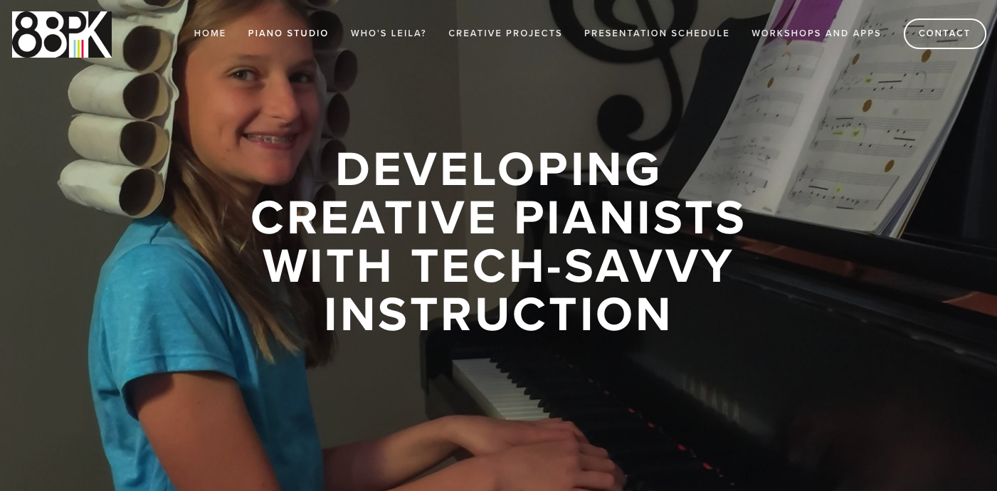
It’s a big, colorful, front door welcome; parents are invited to imagine their child becoming confident, tech-savvy musicians and they will be immediately intrigued by what Leila is offering.
The rest of the page (take a look around!) contains a simple mission statement, a quote from a happy parent, and photos leading to other important pages on Leila’s site. The colors pop against a clean, white background, and parents will know exactly where to go next to learn more. All of the buttons are clear, attractive, and easy to find.
Thanks for Reading
It is our hope that this project inspires you to see your own website in a new way while giving you some clear ideas of how to improve it.
Thanks, Leila, for being such a great sport throughout this project; we have thoroughly enjoyed it and look forward to the continued transformation of your website!

Janna and Jeremy Carlson are the team behind Studio Rocket Web Design, a company that designs websites for music studios.
Janna, the music teacher, has built studios from scratch in three states. She currently owns Hello Piano Studio in Chapel Hill, North Carolina, where she owes much of her success to a great studio website.
Jeremy, the tech guy, builds Studio Rocket Web Design’s websites. His obsession with detail and design comes from a background in audio engineering - and a passion for getting things just right.
Together, the Carlsons build clean, engaging websites that are powerful tools for teachers to use in attracting new students. Janna also keeps a blog to help teachers know how to improve their own websites.
For the month of May, Studio Rocket Web Design is pleased to offer a 10% discount on any website package for Leila 88PK blog readers.
To redeem, mention the code “LEILAV10” when contacting them.
Want to rub shoulders with fellow teachers and innovators like Janna? Then make time to join us this summer at the 88 Creative Keys Workshop in Denver, Colorado.
Sign up here.